Personalizing
You'll spend hours reading in this app, so it's worth a few minutes making the text comfortable. Open File → Preferences… (Ctrl+,) — on macOS, Bible → Preferences….
The dialog is organized into General, Typography, Fonts, Themes, Extensions, and Diagnostics.
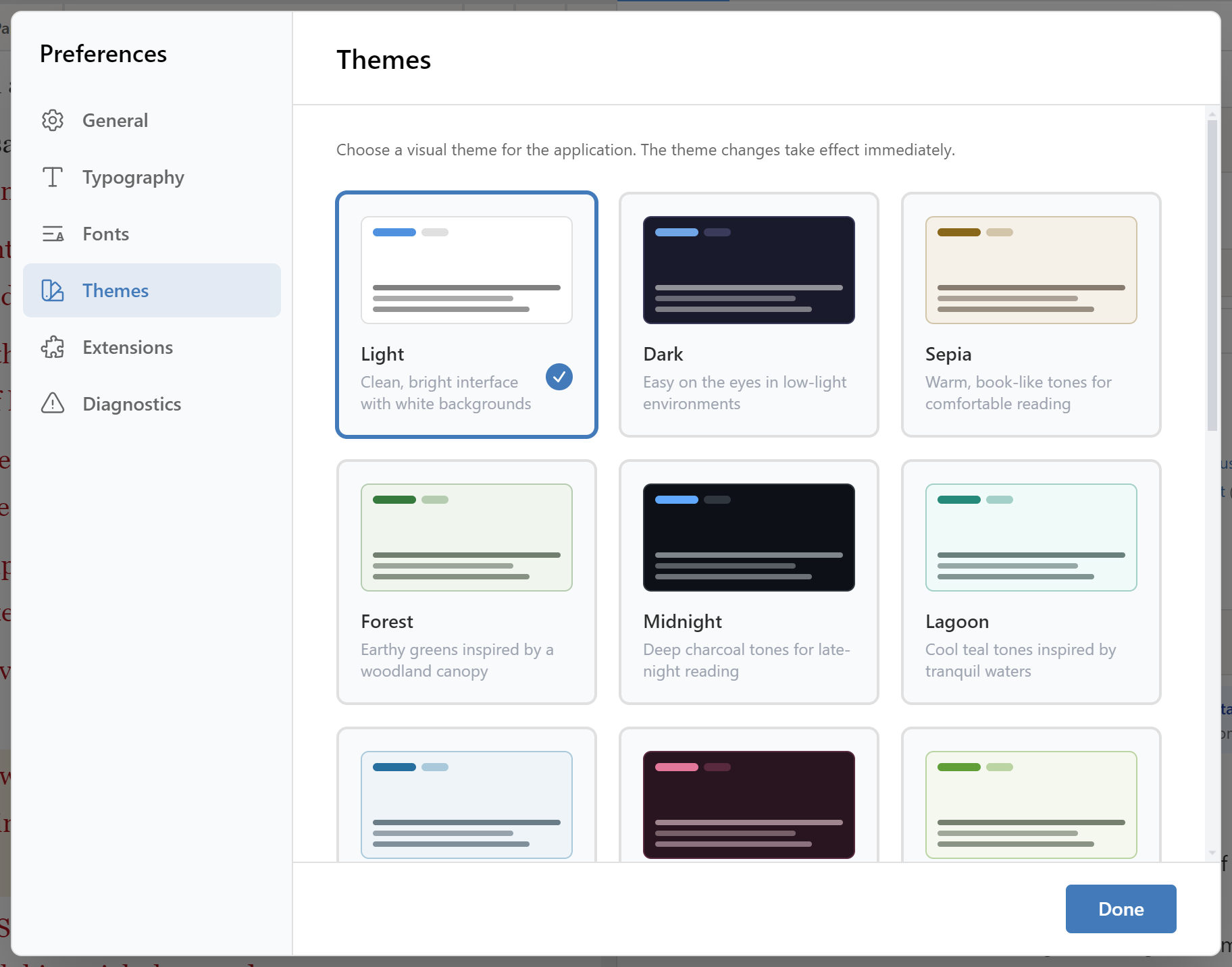
Themes
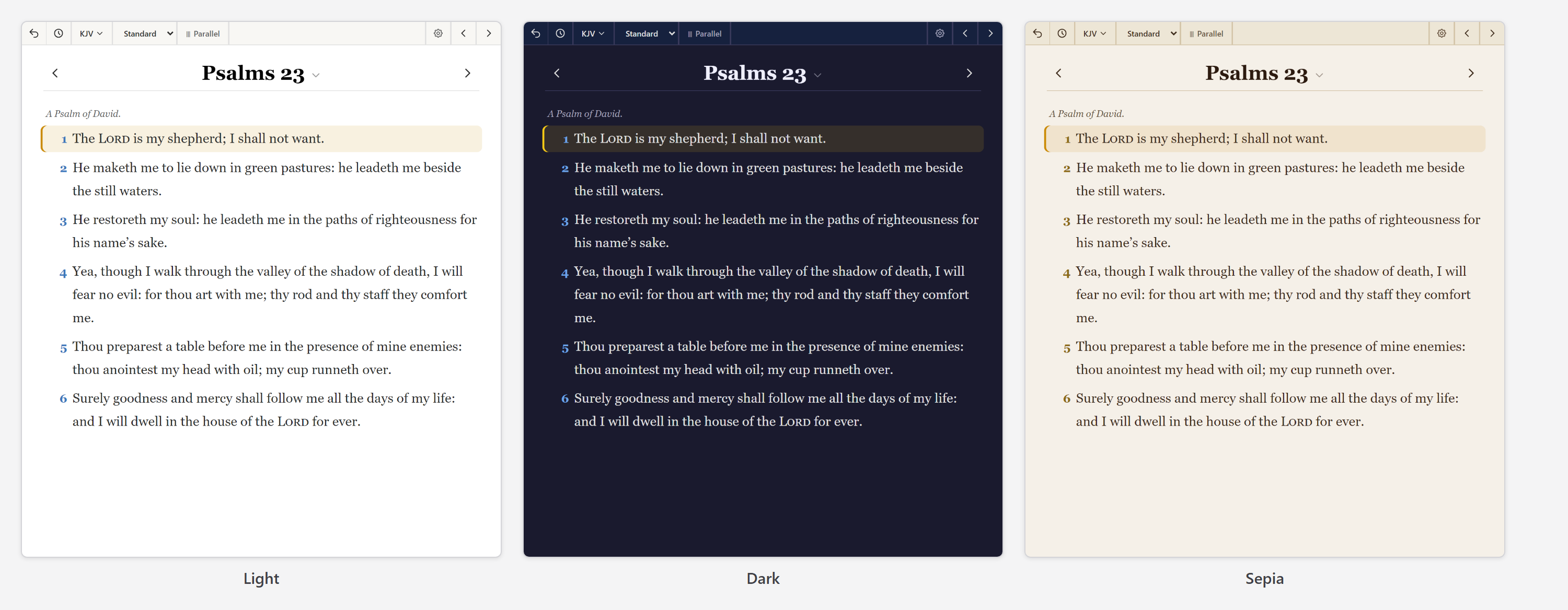
Three themes, switchable from View → Theme or the Themes section of Preferences:
- Light — the default.
- Dark — for low-light reading.
- Sepia — a warm, paper-like background that many people find easiest for long sessions.
Text settings per pane
Each content pane has its own Text Settings, reachable from the pane header. The Bible pane, commentary pane, dictionary pane, and book pane are all set independently — so you can have large serif Bible text next to a smaller commentary without one dictating the other.
Each offers:
- Font family — including serif faces chosen for extended Bible reading.
- Font size — from 14px to 30px.
- Line height — compact through spacious.
- Red-letter text — the words of Christ in red, on or off.
A live sample updates as you adjust, so you're choosing by eye rather than by number.

Global scaling
If you'd rather adjust everything at once than tune each pane:
- Global Font Scale (General section) scales all content panes proportionally, from 70% to 150%. This is the accessibility control — one slider for "everything bigger".
- UI Control Font Size adjusts the interface chrome — buttons, labels, menus — separately from content.
There's also window zoom: Ctrl++, Ctrl+-, and Ctrl+0 to reset. Zoom scales the entire window including the interface; Global Font Scale affects only the text you read. For a permanently larger interface, prefer the preferences; for a quick temporary adjustment, use zoom.
Typography and fonts
The Typography and Fonts sections hold the fine-grained controls — text sizes, line heights, and font family selection — applied globally rather than per pane.
Keyboard shortcuts
See the Keyboard Shortcuts reference, or press Ctrl+/ to open the list inside the app.
Extensions
The Extensions section lists installed extensions. Extensions add functionality beyond what ships in the box; see the developer documentation if you're interested in writing one.
Diagnostics and privacy
Keep Thy Heart Bible Reader works entirely offline and does not require an account. It doesn't track your reading.
The Diagnostics section controls error reporting, which is opt-in — off unless you turn it on. With it enabled, crash reports are queued locally and uploaded in the background to help us find bugs. You can also send a report deliberately with Help → Report an Issue….
Reports are about the application, not your study. Your notes, highlights, and bookmarks are never included.
Recommended starting points
If you're not sure where to begin:
- Long reading sessions. Sepia theme, serif font around 20px, spacious line height, study pane collapsed, Reading Mode layout.
- Detailed study. Light or Dark theme, Bible text around 18px, Study Mode (Quad) layout so commentary and dictionary are always visible.
- Sight difficulties. Global Font Scale at 130–150%, UI Control Font Size raised to match, Dark theme if glare is a problem.