Personalizing Your Experience
The app is made to be lived in for hours at a time, so most of what you see can be adjusted to suit your eyes and the room you are in. This page walks through the settings panel.
Opening Settings
Click the gear icon in the header. A panel opens with tabs down the left side:
- Text Size
- Theme
- Modules
- Gestures
- Offline
- About
Close the panel with Escape or by clicking outside it. Changes save as you make them — there is no Save button.
Your settings live in this browser on this device. They are waiting next time you open the app here, but they do not follow you to another browser or machine.
Themes
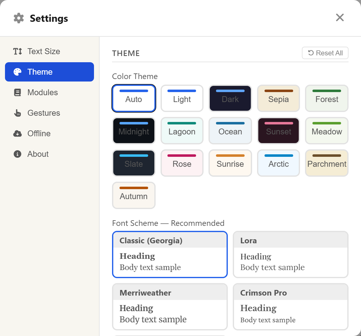
The Theme tab opens with a grid of fifteen colour themes, each shown as a swatch.
The three everyday ones come first:
- Light — crisp white with dark text, for daytime reading.
- Dark — a deep background with soft light text, for evenings and dim rooms.
- Sepia — a warm, paper-like tone many readers find restful over long sessions.
After them come a dozen more: Arctic, Autumn, Forest, Lagoon, Meadow, Midnight, Ocean, Parchment, Rose, Slate, Sunrise, and Sunset. Pick whichever suits; the app changes instantly and you can swap as often as you like.
There is also an Auto setting, which follows your device's own light/dark preference and switches with it.
For quick changes there is a smaller theme button in the header itself, offering Light, Dark, and Sepia directly, with More… to open the full grid.
Fonts
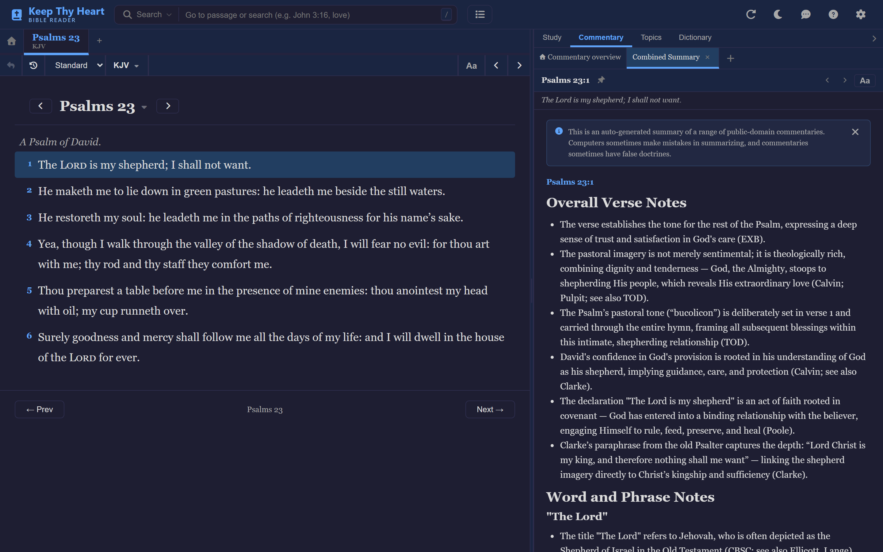
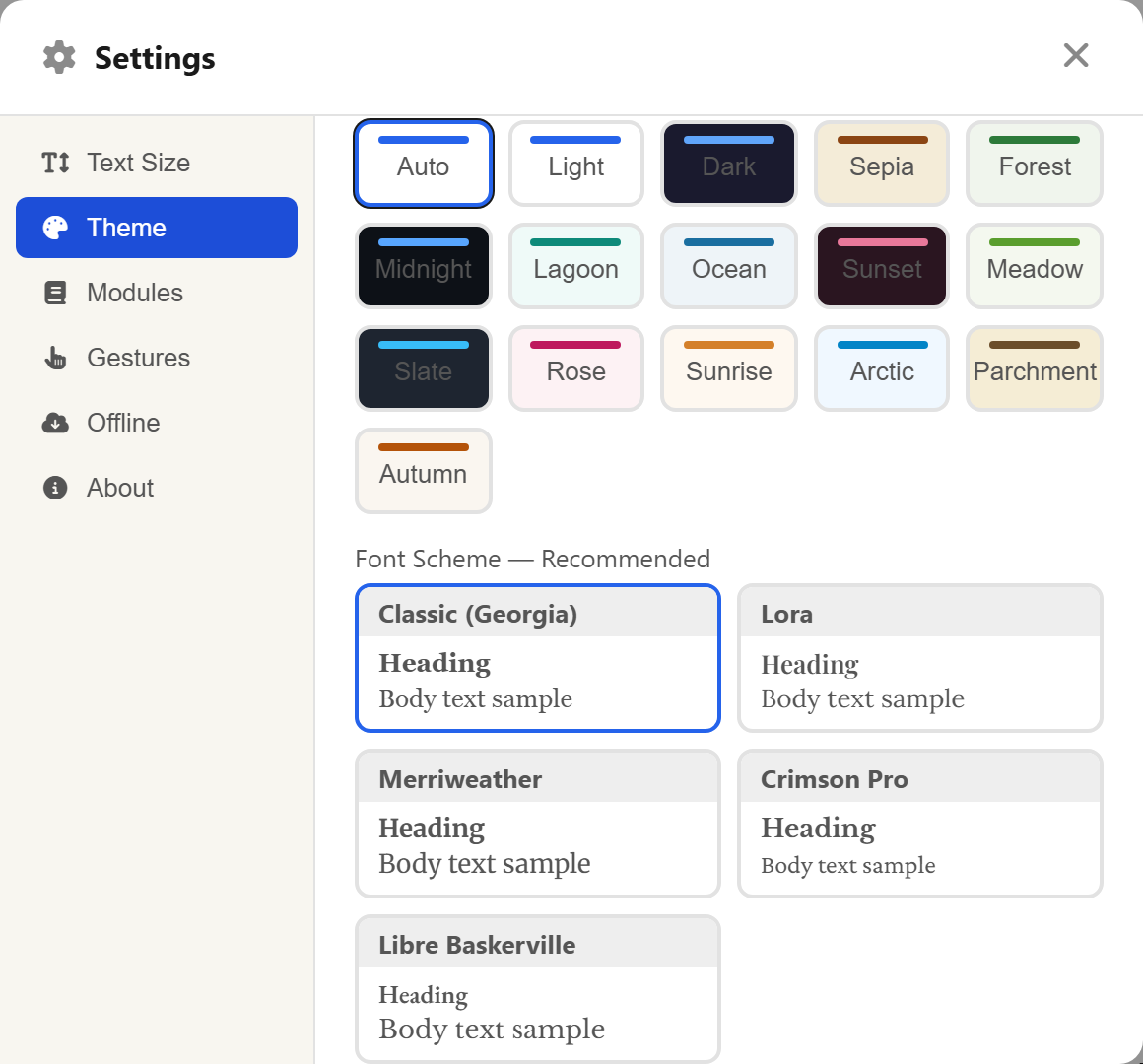
Also on the Theme tab are the font schemes. Each is a card pairing a heading face with a body face, previewed on the card itself so you can see it before choosing.
They are grouped in two. Recommended holds the faces that hold up best over long reading: Classic (Georgia), Lora, Merriweather, Crimson Pro, and Libre Baskerville. Other holds more distinctive choices: Times, Modern (Sans-Serif), EB Garamond, Playfair Display, Cormorant Garamond, Spectral, and Book Antiqua.
Choosing a scheme sets the Bible text, the headings, and the study panels together, so the whole app stays consistent.
Text Size
The Text Size tab starts with a plus and minus control that scales everything at once — Bible text, study panels, and interface together.
Click Advanced for separate sliders:
- Bible Text — the Scripture itself.
- Study Text — commentaries, cross-references, and the other study panels.
- UI — menus, buttons, and labels.
- Bible Line Height and Study Line Height — the breathing room between lines. Taller feels airier and is easier over long stretches.
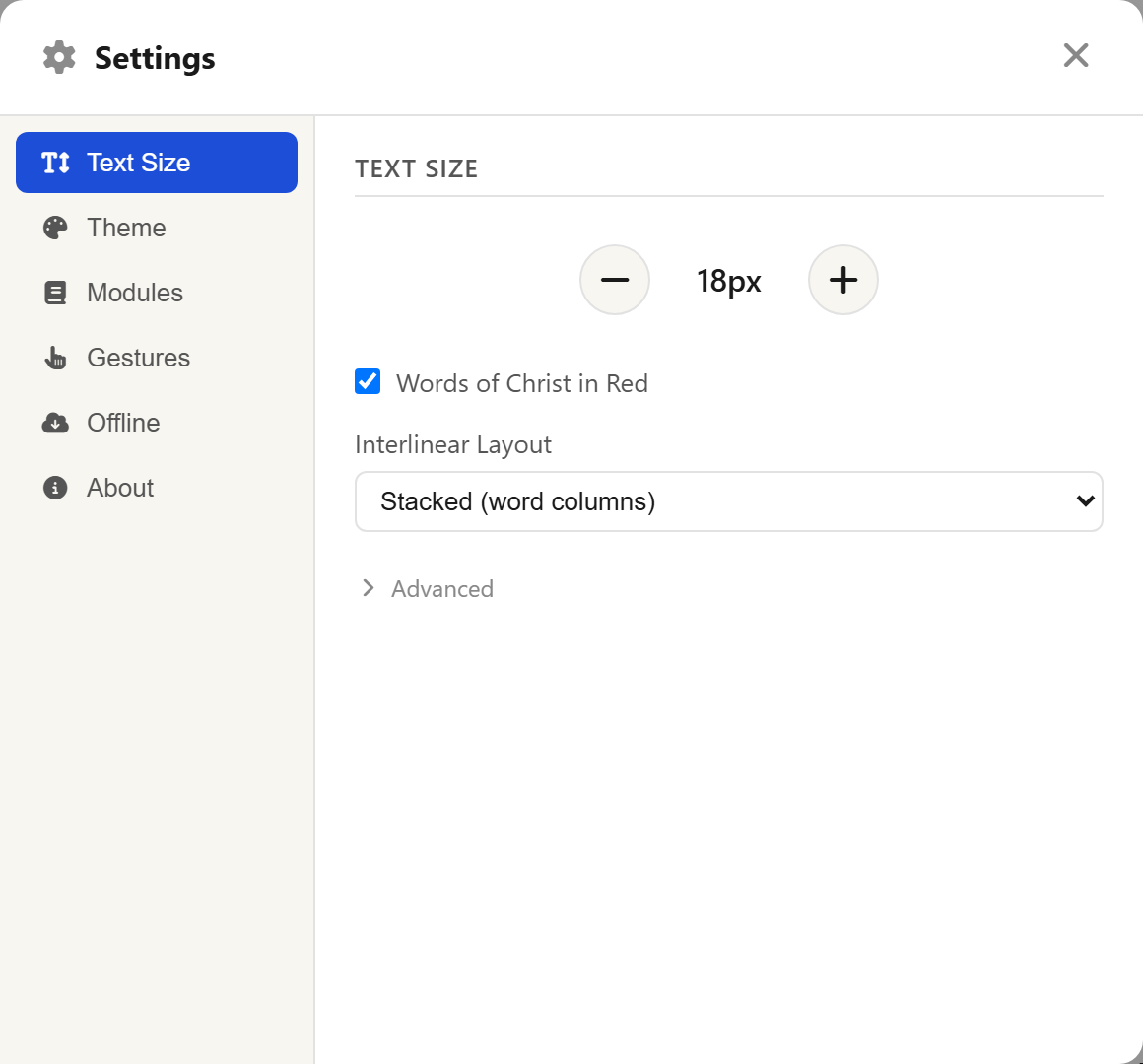
Two more settings live on this tab:
Words of Christ in Red. A long-standing convention in many Bibles. It affects the reading area only, and only in translations that carry the red-letter information.
Interlinear Layout. How original-language words sit against the English in Study mode — Inline (in parentheses), which keeps the text flowing, or Stacked (word columns), which lines each original word up beneath its English word.
Modules
The Modules tab controls which study content is offered.
Show combined commentary overview tab turns the auto-generated Commentary Combined Summary on or off. Below that you can choose which topical indexes are active.
The translations and commentaries available to you are chosen by whoever runs the site, so this tab shows what that site has loaded rather than everything that exists.
Gestures
The Gestures tab tunes touch behaviour — most useful on a phone or tablet.
Swipe to change chapters lets a horizontal swipe across the Bible pane move to the previous or next chapter. Two thresholds set how far a swipe must travel before it counts: one for the Bible pane, one for swiping between verses in the Commentary pane. Raise them if chapters change when you did not mean them to; lower them if swiping feels like hard work.
Left-Handed Mode
If you hold your phone in your left hand, the busiest tabs are easier to reach on the left. Left-handed mode, on the Theme tab, flips the bottom navigation bar to suit. It affects the mobile layout only. See Using on Your Phone.
About
The About tab carries the version and licence information — the app is free software under the GNU General Public License v3.0 — along with a link to the source code and a Refresh App button for when something looks stuck.
What's Next
- Managing what is stored on your device: Working Offline.
- How these settings play out on a small screen: Using on Your Phone.